D2C and e-commerce conversion
@edward.builds
Seven before/after landing-page A/B tests show the same pattern: remove navigation, shorten forms, cut copy, use one clear image and one obvious button, and conversions rise 2x to 15x.
16k plays · 07 Oct 2026
What they said
Cases (speech + caption, numbers from the caption):
- Yuppiechef (wedding registry): removed the top navigation; conversions 3% -> 6% (doubled).
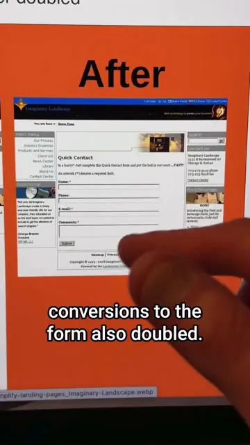
- Imaginary Landscape (contact form): cut 12 fields to 4, shortened intro copy; submissions +160% (speech says "doubled"; caption says 160%).
- Career Point (nursing/medical training page): shortened form, big obvious image of a nurse at top before scrolling, removed navigation, one clear CTA; conversions 3.12% -> 13.64% ("more than quadrupled").
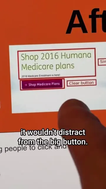
- Humana homepage banner: cut text to one short line, made paginator grey so it doesn't compete, made the shop button the obvious focus; clicks +1,456% ("over 15x" in speech; "Shop Medicare plans" button; original banner mentioned "Save on prescription drugs, over $3,637 a year").
- Ring (create-account screen, mobile app): replaced the video background with a plain grey/dark background ("Design A" video vs "Design B" plain, labelled "Winner"); more accounts created (no figure given).
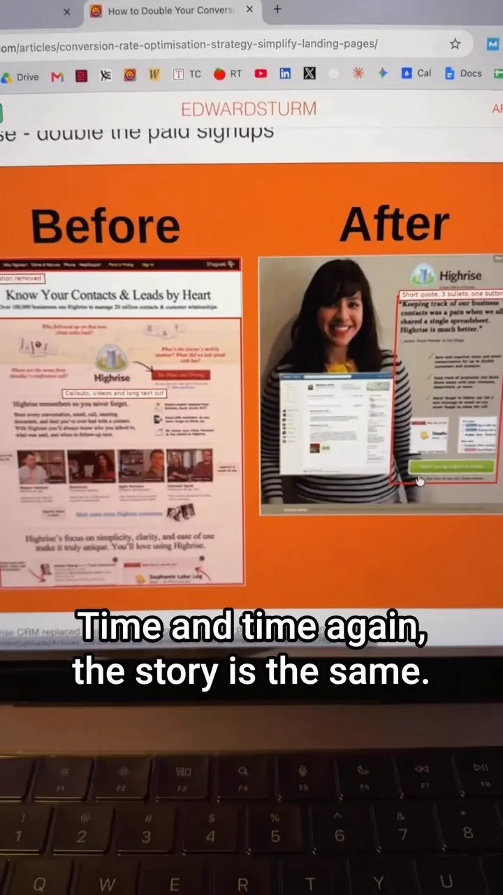
- Highrise (CRM): replaced a cluttered homepage with one customer photo, three short bullets and one CTA button; paid signups doubled.
- Summary lines: "Time and time again the story is the same", "You can make more money by doing less - by reducing the amount of distractions to your main call to action".
- CTA: all 10 examples and sources at freeseoknowledge.com (spoken "freeseonowledge"), article "How to Double Your Conversions by Doing Less (10 Before-and-After Examples)".
- Caption lists only 6 of the 10 cases, with the pattern "remove distractions, simplify the page, make the main action obvious".
Try this
- Landing pages with one goal: Remove the top navigation. In the first example, conversions went from 3% to 6%.
- Forms: Cut fields. One example went from 12 fields to 4 and submissions rose 160%. Ask only for what you need to follow up.
- Copy and visuals: Use one short line, one clear image and one obvious button. Make secondary items, such as a banner pager, quieter.
- Product screens: Test a plain background against a busy video background on sign-up pages.
- Homepage: Reduce it to one customer photo, three short bullets and one button.
- Test properly: These are single tests from public write-ups. Run your own A/B test, and keep the navigation on pages where visitors browse many items, such as shop categories.
Links
- freeseoknowledge.com, article "How to Double Your Conversions by Doing Less (10 Before-and-After Examples)" by Edward Sturm (hosts original sources).
- Case sources mentioned: Yuppiechef, Imaginary Landscape, Career Point, Humana, Ring, Highrise.
- No testing tool named.
Watch the original
Watch the full reel on Instagram by @edward.builds. Follow them for more.
Video, voice and ideas belong to @edward.builds. Shown here as a short preview with our own summary, for commentary and education. Want it removed? Tell us.
00:00
/
00:00
More D2C and e-commerce conversion

Liked this one? Get the next
When I find a reel worth acting on, you get the short version: what it says and what to do. Free, rare, one click to leave.
Rather have it done for you? Work with Tanish