@shovel.studio
Small catalogs (under 50 products) win with less choice (Yeezy: gender split, product-listing page as homepage, delayed email pop-up, no express checkout) while big catalogs (Skims: sale/category/gender split, filters, model shots, express checkout) need discovery tools; each has stats attached, none sourced.
337k plays · 08 Sep 2026

What they said
Yeezy (small catalog):
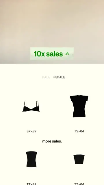
- Splits traffic into Male / Female at entry; "less choice means 10 times more sales when you have less than 50 products" (green tag "10x sales").
- Almost no homepage: you land on a PLP (product listing page), saving one click.
- The PLP "feels more like art"; items sort with one click, sometimes refine into colours.
- Zero info on sizing or shipping, which "hides the fact that it can take weeks to ship".
- Teases new releases (e.g. "the new Yeezy 800s available December 2026"); a 6-10 second delay on the email pop-up gets 26% more emails vs a pop-up that shows instantly (green tag "26% email sign up"). Skims (large catalog):
- Splits traffic between sales, category and gender (homepage tiles: markdowns, matching sets, men's clothing, etc.).
- "76% of shoppers use filters when there's more than 50 items."
- "Model shots can lift sales up to 20-30% over flat lay shots" (green tag "+20-30% sales").
- The only branding touch he likes: the chosen colour swatch on the product matches the button colour (the PDP add-to-bag button changes to the lilac of "Iris Mica").
- No third-party express buttons like Apple Pay or Shop Pay on the PDP; "I've seen an AOV increase up to 40% without them" because skipping quick checkout makes you find more things to buy (tag "+40% AOV"); cart shows "Frequently bought together" and a free-shipping bar.
- Close: learned how to design small stores, big stores, and UX that performs better for both; "follow for more web design".
Try this
- Small catalogues (under about 50 products): Cut choices at the door. Split visitors by category or gender and land them on a product listing page instead of a busy homepage.
- Large catalogues: Invest in discovery: filters, category and sale entry points, and model shots. Test model photos against flat lays on your best sellers.
- Email capture: Delay the sign-up pop-up by a few seconds and compare sign-up rate against an instant one.
- Product pages: Make the colour swatch change the button colour or image. It is a small detail that makes the page feel considered.
- Checkout: Test removing or keeping express checkout buttons. The claim that skipping them lifts order value is unsourced, so look at revenue per visitor, not just basket size.
- Do not copy blindly: Hiding shipping times is a trust risk, and celebrity brands have traffic that you do not.
Links
- Reference sites: yeezy (site shown) and skims.com. No tools, links or sources named. Visible UI: Klarna/Afterpay installment text, Shop Pay/Apple Pay buttons on a Skims PDP frame (Apple Pay/Shop Pay highlighted with a red dashed box).

Watch the original
Watch the full reel on Instagram by @shovel.studio. Follow them for more.
Video, voice and ideas belong to @shovel.studio. Shown here as a short preview with our own summary, for commentary and education. Want it removed? Tell us.
00:00
/
00:00

More D2C and e-commerce conversion



Liked this one? Get the next
When I find a reel worth acting on, you get the short version: what it says and what to do. Free, rare, one click to leave.
Rather have it done for you? Work with Tanish